Hey there! I'm Emma - the founder of Homeward Creative Co.®, a boutique design studio based in Tulsa, Oklahoma. My mission here is to help purpose-driven business owners tell their brand's visual story with clarity and confidence, so they can do the work they were called to.
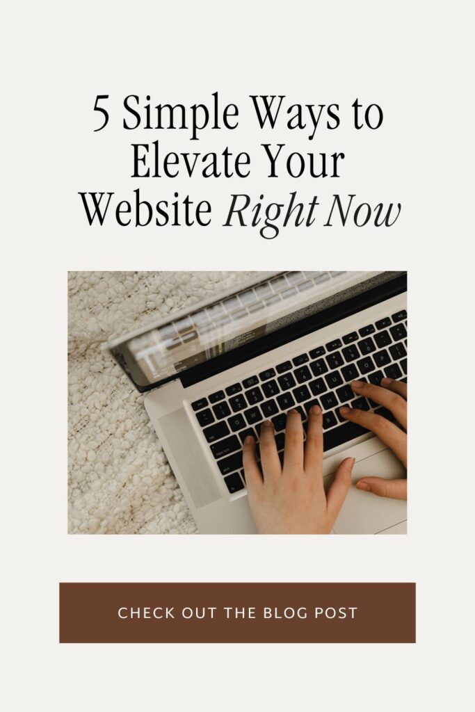
5 Things you Can Do to Improve your Website Right Now
Your website is the face of your brand, so it’s important that it looks great and functions well for your viewers. As a brand and web designer, I’m constantly asking myself what I can do to improve my website. If you’re a fellow small business owner, I bet you’ve done the same!
Here’s some good news, though: improving your website doesn’t have to be an overwhelming task. In fact, there are five simple, yet powerful things you can do right now to elevate your online presence and help convert your audience into customers. Keep scrolling, friend, and let’s dive in!
1. Add White Space
Aka: let your content BREATHE. When there’s not enough empty space between elements, it can make your site feel a bit.. eh.. cluttered. It’s hard on the viewer’s eye, and can cause them to get overwhelmed and exit your site REAL fast.
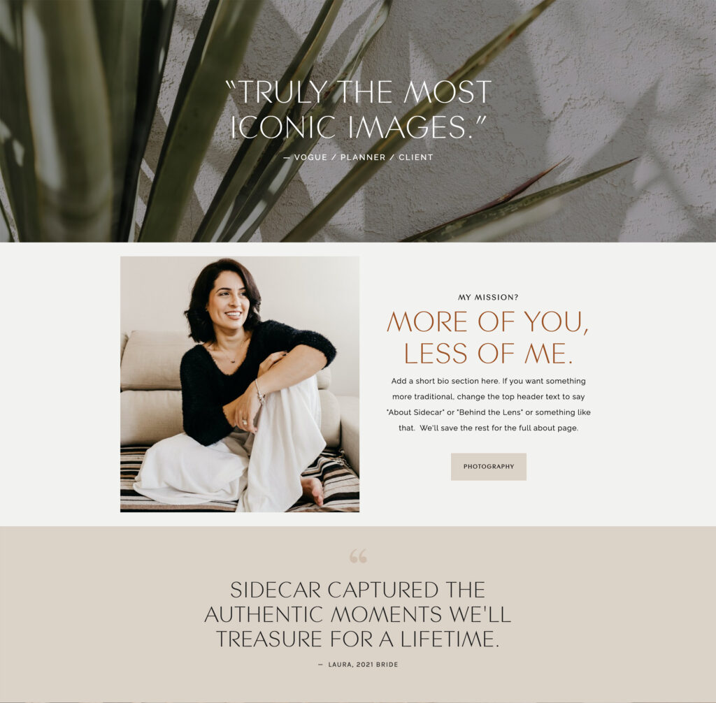
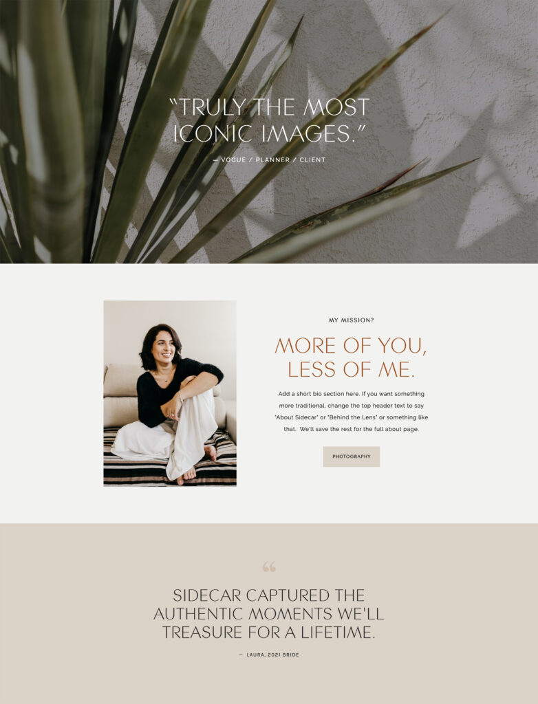
Take a look at these examples. In the layout on the left, the text boxes are too close together, the testimonial sections are a bit short, and the image of the woman is almost squished between the other two sections. There’s no breathing room between the elements.
On the right, the sections are bigger, the text boxes are spaced more evenly, and the image has plenty of breathing room on all sides.
If you were to scroll through these websites on your browser, the version on the right would feel clean, professional, and easy to navigate. The version on the left leaves no time for the viewer’s eye to take a break before moving on to the next section. So, it ends up feeling busy, cluttered, and chaotic.
This is your reminder that you don’t need to fill every space with something. White space IS a design element, and can make a HUGE difference in how professional your site appears. Don’t be afraid to make sections bigger and put more space between elements!
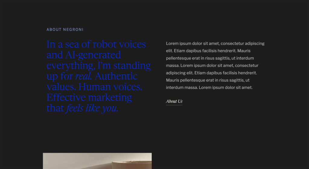
2. Increase Contrast
For example, if you have light-colored text on a white background, or dark text on a dark background, it’s going to be hard to read. You’ll want to make sure there’s clear contrast between the content and the background color.
This is not only good design practice, but it also makes your site and content more accessible for those with disabilities.
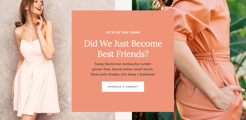
Let’s look at a couple of examples. In the website section on the left, the light brown heading and dark gray paragraph don’t contrast enough against the neutral background. It’s hard to read. If we lighten up the background and darken the text just a bit, we have a section that stands out, and it’s much easier to read.
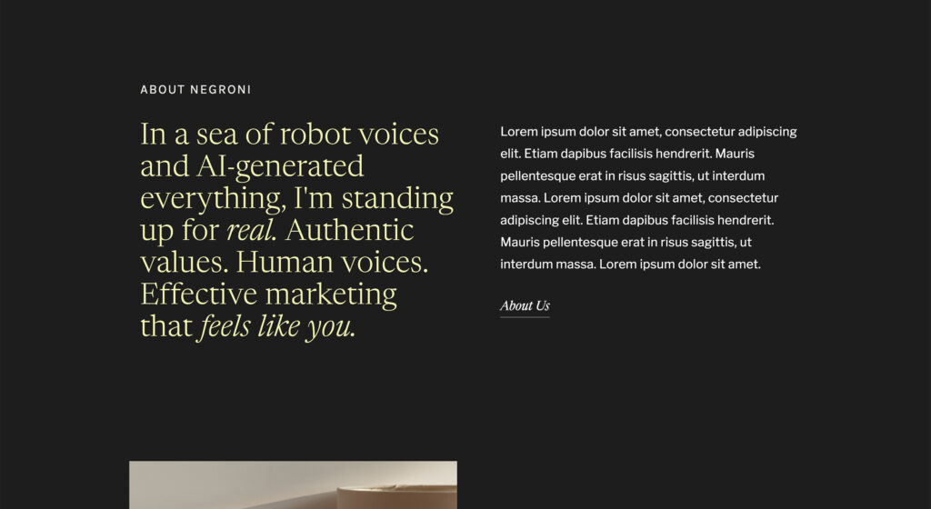
Now let’s try it with a dark background. You’re not limited to white text on a black background, but you do need to make strategic color choices.
For example, colors like dark blue, red, or purple don’t stand out enough against a black background. It kind of hurts your eyes, right? Yellow would probably have the same effect. However, in the example on the right, a pale yellow has much better contrast.
Take a look at your website, and make sure there aren’t any sections that are hard to read. If there are, tweak the colors just a bit to provide better contrast. Your website viewers will thank you!
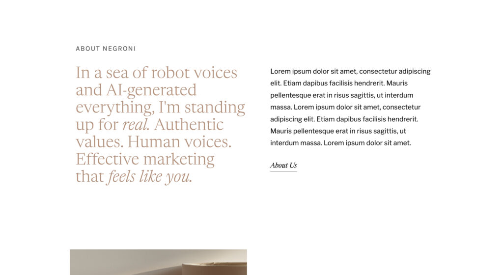
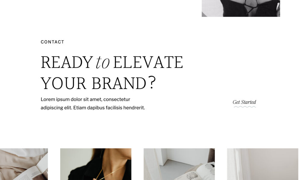
3. Make Sure there’s a Clear Type Hierarchy
Type Hierarchy is essentially the way your text is organized on your site (i.e. headings, subheadings, paragraphs, etc.). Without it, all the text would look the same.
The purpose is to highlight information in order of importance, and to break up text for easier readability. Plus, it looks SO much better!
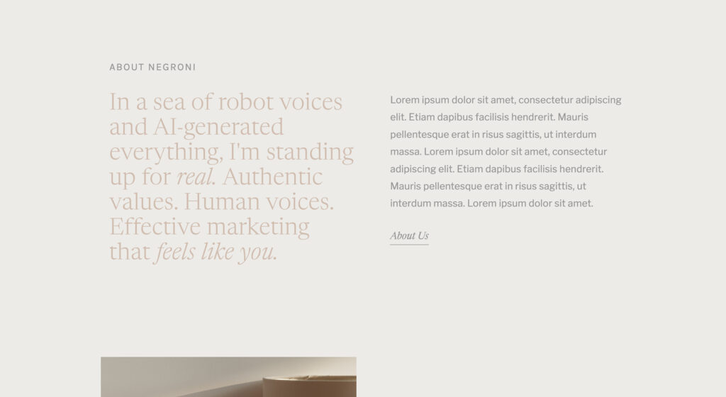
In the example on the left below, the sections have been separated, and the primary heading has been capitalized to make it stand out. But all the text is the same size and font, even the link. There’s no style variation, and it can easily be missed by a viewer.
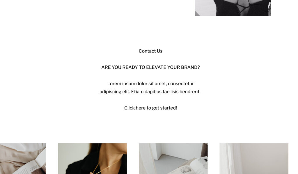
On the right, there are four different styles of text: the subheading (“Contact”), heading (“Ready to elevate your brand?”), paragraph, and button text (“Get Started”).
By organizing this section of text into a hierarchy, it catches your attention, looks much better, and the link is much less likely to be missed by a viewer.
If you have a chunk of text on your site, break it up into sections of different sizes and styles!
4. Add a Call-to-Action on Every Page
A CTA tells a user what to do next, like a button or a form. With any website, you want to guide the user where they need to go. If they scroll to the bottom of a page and don’t know where to go next, you’ll lose them.
Go through every page on your site and make sure there’s a clear next step for your users.
P.S. Be sure to use unambiguous titles on your buttons — sorry guys, but something like “let’s adventure” is confusing… Something like “Book your Shoot,” “Send Me a Message,” “See the Portfolio,” etc. is much clearer. You can still be creative here! Just make it obvious to the viewer what’s going to happen next.
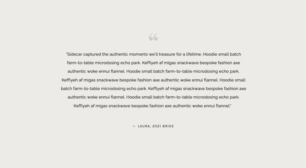
5. Update your Testimonials
Don’t just show your site visitors how good you are, let your clients tell themin their own words! Social proof is SO important on a website (we all look at Amazon reviews before making a purchase, right??). If you don’t have any reviews on your site, or they’re just a bit outdated, reach out to your past clients and get some updated feedback!
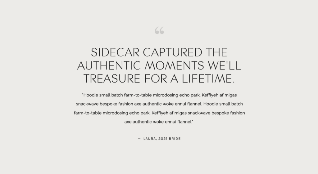
P.S. That type hierarchy point is important here too. I know that 3 paragraph review is SO good, but most people won’t read it when it’s copied and pasted in one big chunk. Call out the most important line. Make it bigger! Viewers are much more likely to read it that way.
Too much of the same text style. Feels overwhelming, and not likely to be read.
Most important line called out in a larger heading to capture attention. The rest of the review is now more likely to be read!
These five tips are some of the simplest things you can do to improve a website, but they make a huge impact! I hope this empowers you to make some of these changes to your own site!
Does your branding feel inconsistent? Disconnected? This free workbook will walk you through how to use Pinterest to discover your brand's unique style.