Hey there! I'm Emma - the founder of Homeward Creative Co.®, a boutique design studio based in Tulsa, Oklahoma. My mission here is to help purpose-driven business owners tell their brand's visual story with clarity and confidence, so they can do the work they were called to.
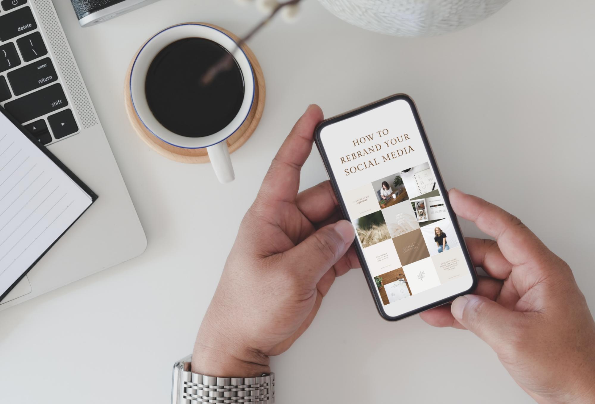
How to Rebrand your Instagram and Social Media After a Logo Redesign
So you’ve just completed a rebrand for your business (yay!), and now it’s time to figure out how to rebrand your Instagram and other social media accounts. Right? You finally have your beautiful new logo files in hand, so of course you’re more than ready to start sharing them all over social media.
But let’s press pause for a sec – even though you’re finally confident in your brand’s visual elements, there’s a strategy to branding on social media. The last thing you want is to invest your time and money into rebranding your business only for it to go unnoticed by your dream clients, all because it wasn’t introduced strategically.
So, before you do anything with your new brand elements, take note of these best practices for rebranding your Instagram and social mediaaccounts.
Side note: all of these tips (except for # 1) apply to existing brand identities too! So even if you’re not rebranding your business anytime soon, this info can help improve your social media presence and attract your dream clients.
How to Rebrand your Instagram and Social Media Accounts Strategically
1. Plan Your Launch
Resist the urge to completely revamp your social media in one sitting without a little warning first! Plan how you’re going to launch your new brand identity ahead of time. Tease your audience with announcements over the course of a week or two hinting that something new is coming. This will build up anticipation for your rebrand and get your audience excited, and you won’t blindside them when you launch your new look.
While you’re at it, make sure you plan to update everything at the same time. This includes all your social media channels, your website, YouTube page, business cards, documents, signage, email signatures, etc. If it has your logo on it, update it. Your branding should always be consistent in all locations to avoid confusing your audience.
2. Use the Right Files
When uploading a graphic to social media, PNG files are usually best. PNG files are designed to work best on digital platforms, and they support transparent backgrounds, so you can place your design on top of any color background without that white box you see in JPG files (see below). Also make sure your image files are at a high resolution – at least 300 pixels per inch (ppi) – to help avoid blurriness.
Please don’t use a JPG logo file like this when making graphics for social media!
3. Size Your Images Correctly
Let’s say you’ve taken the time to create the perfect cover photo for your Facebook page, but when you click “upload,” part of your image gets cut off. SO frustrating! But there’s a simple way to help avoid this problem – use the right graphic dimensions. Social media platforms are always changing their image sizes, so make sure you’re using the most updated dimensions. Sprout Social’s Always Up-to-Date Guide to Social Media Image Sizes is a great resource for this.
4. Let Your Logos Shine
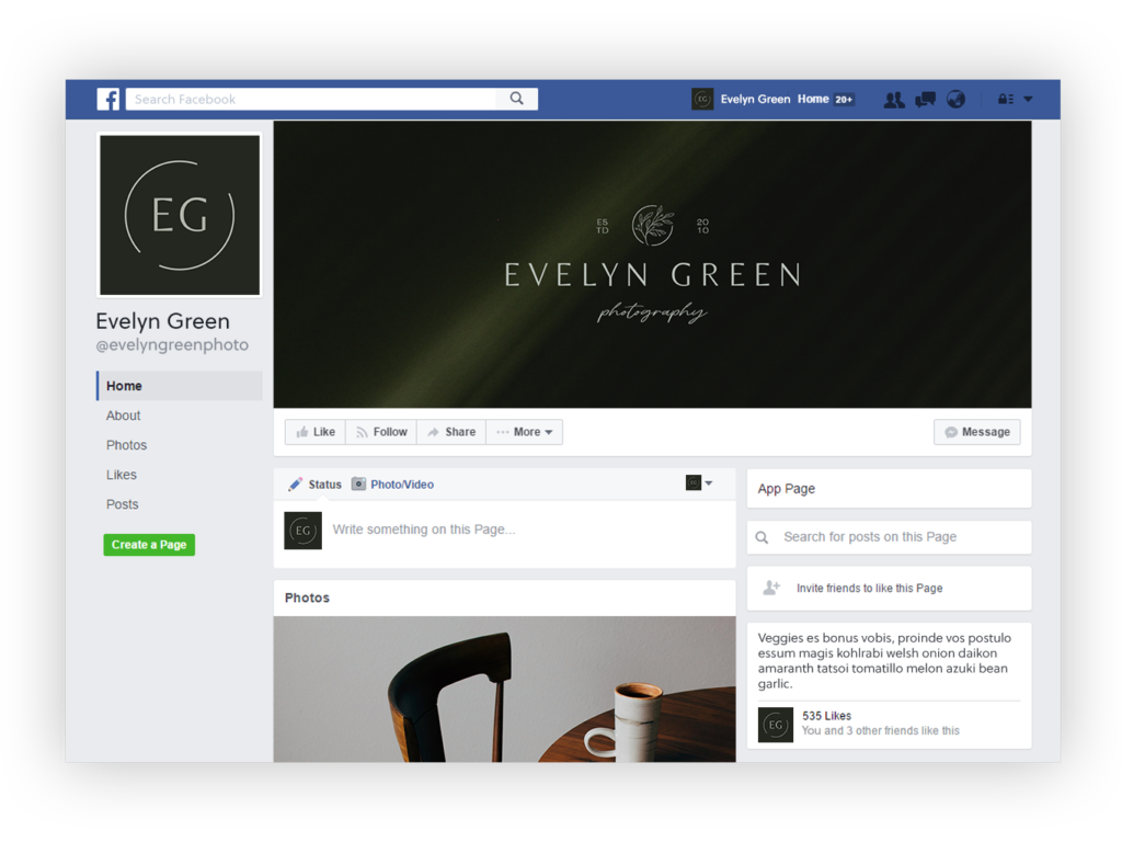
When sharing your branding elements on social media, using the right logo in the right spot will really help them stand out. If you choose to use a logo for your profile photo, consider using an icon or submark version. These types of logos are easier to see and make a stronger impact on the viewer when scrolling through a social media feed. Save your more detailed primary logo for your website, your Facebook cover photo, and anywhere that provides enough space for your full logo to be visible and readable.
Another side note: Not all businesses should use a logo as their profile photo! For example, let’s say you’re a photographer or designer. If you mostly post photos from shoots or mockups of client work, that’s fine! But potential clients won’t know what you look like, and people want to know who they might be working with! If this sounds like your business, it‘s smart to use a photo of yourself as your profile image instead.
The icon logo in this profile photo stands out so much more on a Facebook feed than the larger primary logo would.
And while we’re on the subject, please don’t put a dark version of your logo on a dark background! This also goes for putting your logo over a busy background – just don’t do it. Your logo should always stand out and be easily visible, so contrast is key!
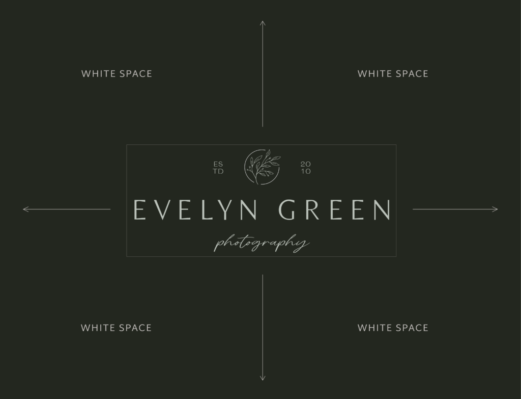
5. Utilize White Space
White space (sometimes called negative space) is the empty space around or between design elements.
Designers use white space to balance design elements, call attention to a graphic or piece of text, and prevent a design from becoming too busy. White space gives the viewer’s eye a break and promotes a sense of calm. Some minimalist brands even use extra white space in their designs for a higher sense of luxury.
White space is the empty space around or between a design element. It doesn’t have to be white – it can be any solid color, a pattern, or a background image.
When learning how to rebrand your Instagram and social media – or just making graphics for every day posts – this is one of my biggest pieces of design advice. Even if your brand voice isn’t calm or minimalist, utilizing white space is a crucial design practice for every brand. When creating graphics for social media, you have to to leave some extra space around your logos, text, shapes, etc. (unless it’s a purposeful design choice).
Here are a couple examples:
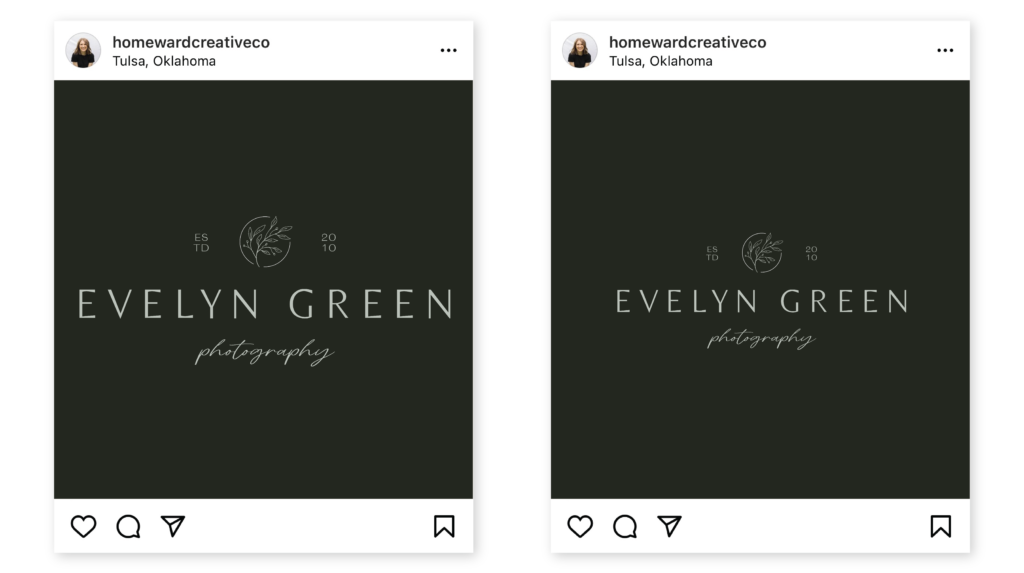
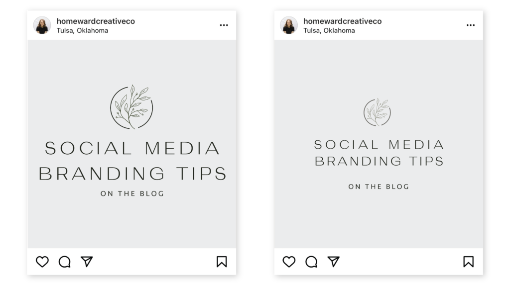
The post on the left leaves no white space on the sides of the logo. The post on the right balances the space and allows the logo to breathe. Can you tell how much easier it is to look at the logo on the right? White space keeps viewers looking at your design longer because it’s easier on the eyes.
Once again, the post on the left leaves no white space on the sides of the text, and the space between the heading and subheading is too tight. With a little more white space and a few tweaks to the letter spacing, we get a much cleaner design with the post on the right.
Sometimes less really is more! So next time you’re designing graphics for your brand’s Instagram or social media, remember to let your logos breathe.
6. Stick with an Aesthetic
I get it. Keeping up with a specific aesthetic can be hard sometimes. Don’t let fretting over the perfect Instagram aesthetic distract you from serving your clients (which is ultimately the most important thing). However, consistency is key to branding. When you’ve invested time and money into a rebrand, following your new brand guidelines isn’t negotiable – it can be the difference between seeing a return on your investment or not.
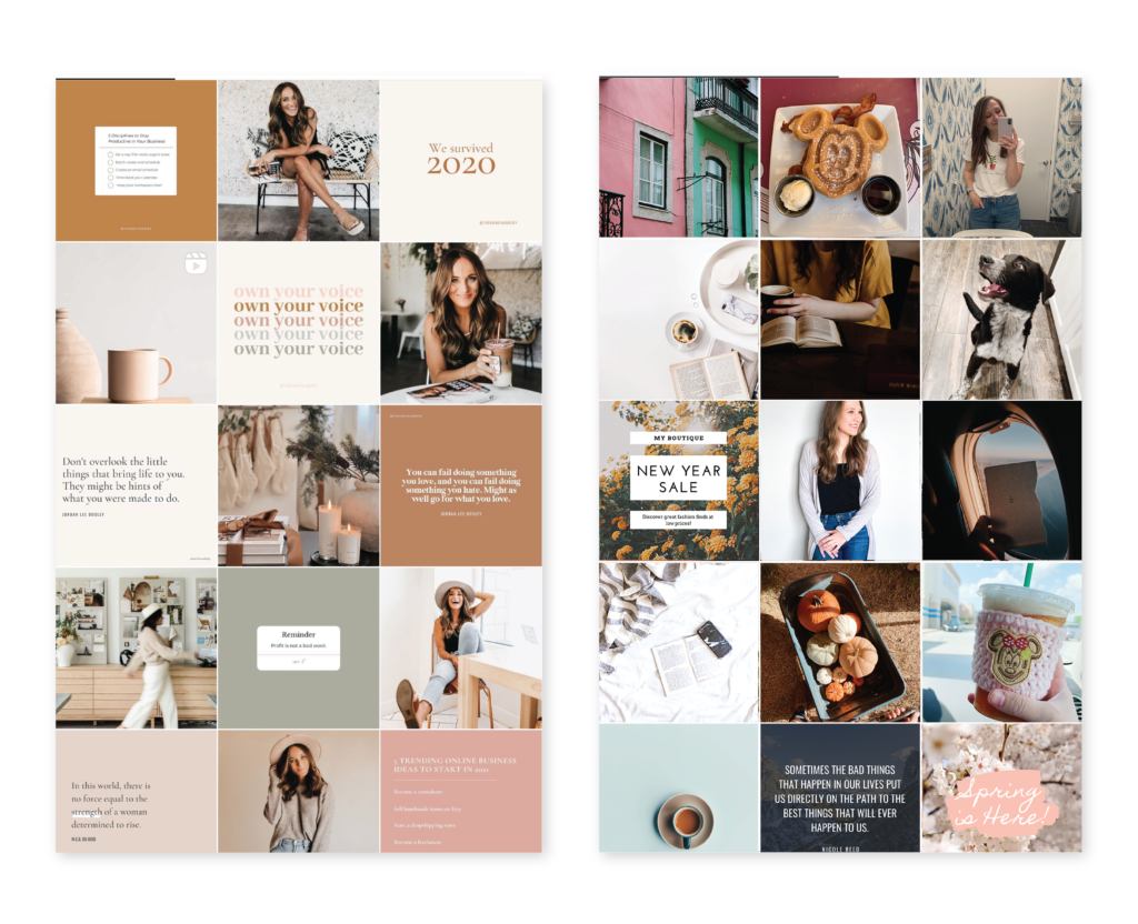
The overall look and feel of your brand can either attract or turn away your ideal clients. A curated and consistent brand style will improve brand recognition, show you care about the details, and it looks more professional. Just look at these two Instagram profiles – which one looks more experienced and established?
Left: @theownitacademy | Right: Mockup by me
There are several apps out there you can use for planning out your Instagram feed. I personally use a Canva file to see how everything will look together. Use whatever works for you!
7. Don’t Stop at Just the Logo
Remember, your brand isn’t just a logo – it’s the entire experience. A whole identity. It’s your personality, your values, how you communicate, and what people feel when they interact with your business. Is your business quirky, casual, and carefree? Your images and captions should be too. Make sure your brand experience complements your brand look, and you’ll be well on your way to attracting your dream clients!
Now it’s time to rebrand your Instagram!
You’ve put in the hard work to choose a designer and build a custom brand identity. Now, make sure to get the most out of your investment by learning how to rebrand your Instagram strategically! Your business will thank you.
And be sure to join the Homeward Newsletter! This is where you’ll find more branding and business education like this, delivered straight to your inbox, at a pace that doesn’t feel overwhelming. No bombarding you with emails – just the occasional note that feels like an update from a friend.
Ready for a brand and website that communicates your story beautifully, reaches the clients you were meant to serve, and finally feels like home?
Does your branding feel inconsistent? Disconnected? This free workbook will walk you through how to use Pinterest to discover your brand's unique style.